The brief
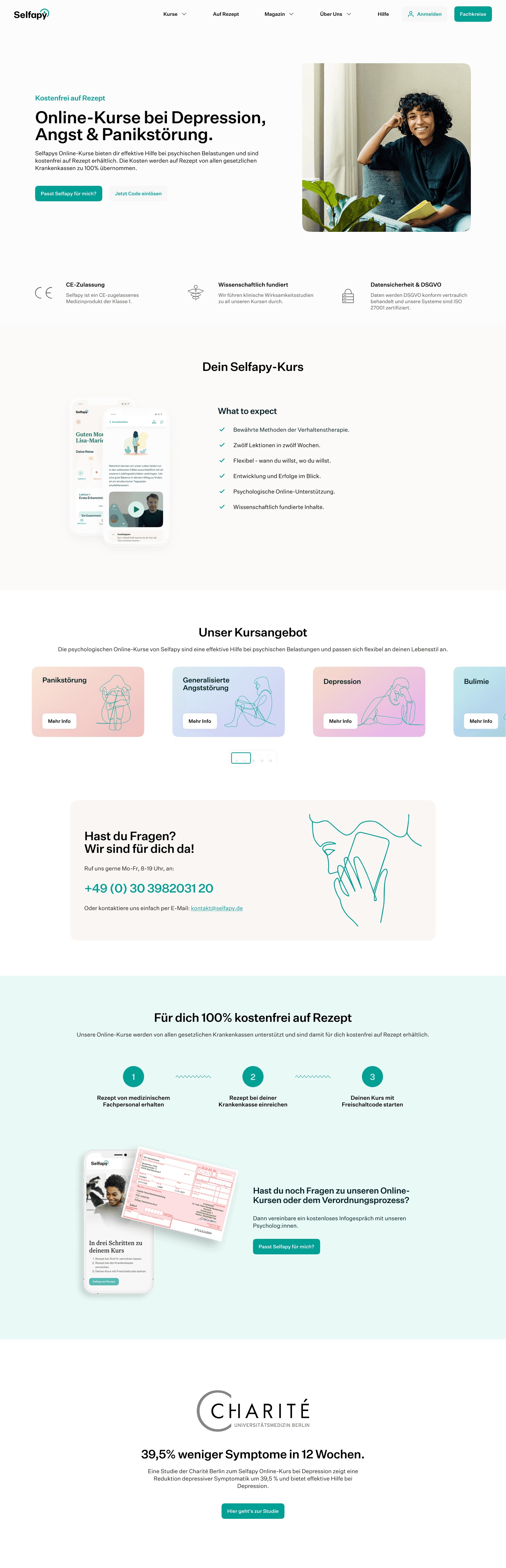
A few months into working with Selfapy, I was producing marketing assets and needed to get familiar with the app itself. That’s when I noticed the product and the website didn’t match. Different color palettes, different typography, enough of a gap that users were mentioning it directly, some assumed they were using two separate services rather than one.
The fix
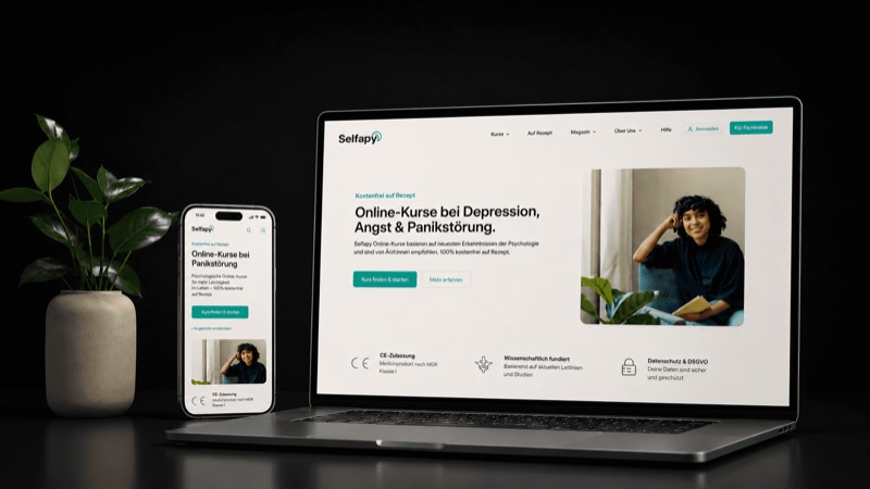
Both teams already knew about the disconnect, so there was no pushback and no case to build. The fix went straight into production. I reworked the layout, the card design, the color system, and the typography, and the result became an updated component library rather than a one-off patch, something the team could keep using going forward.
The catch
The main constraint was technical. The CMS in place at the time wasn’t easy to work in, which limited how fast engineering could implement changes. That shaped the pace of the rollout more than any design decision did.
What happened
The feedback after launch came mostly from existing users, who noticed the product finally read as one thing instead of two. Leadership was glad to see the brand unified across both fronts. Looking back, I’d want Sales and Marketing involved from the start next time, building the website’s goals around business strategy up front instead of fixing a mismatch after the fact.